
Geography: Section 3
Results and Assessment: Air Pollution around Our School
This section of the website is linked to an online tool that helps you visualise the data you and other schools have collected. If your school requested an air quality sensor or has completed the Travel to School Survey or Traffic Count, you will be able to view your results in the form of maps, graphs and charts. If your school hasn’t carried out any of these surveys you can still access this online tool to view example data or that from other schools.
After completing this section you will be able to:
- Gather information from bar graphs, line graphs and pie charts.
- Assess the patterns of air quality around your school and when air pollution is at its greatest
- Consider the impact that traffic around your school has on air quality
- Identify the main method of transport used by your class to travel to school.
- Identify which method of transport contributes the most to air pollution outside your school and what contributes the least.
To help navigate and analyse the data please download & print the Activity Sheet for this section. In order to complete the activities on the Activity Sheet pupils will need access to computers so they could work individually or in pairs to complete the activities.
The Air Sensor
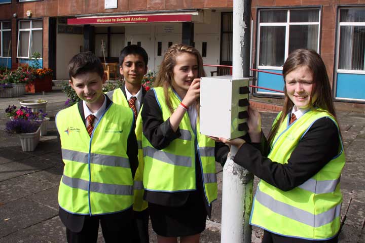
If your teacher/school has requested one, an Air Sensor has been installed around you school to measure patterns of air pollution (particulate matter) from vehicle exhausts and these results will automatically be sent back to our database.
Using the sensors and the data you entered in the Section 2 you can analyse the levels of air pollution at your school and identify the causes of the pollution. If your school hasn’t setup a sensor you can still access this online tool to view example data or that from other schools.